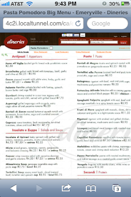
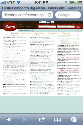
According to google analytics 25% of Dineries users are visiting us on a mobile device. Up until now we have not made any attempt at making the site mobile friendly. The biggest issue was with our "BIGGER" menu display. We built this menu displaying system to make it easy for our users, maximizing your monitor space if the menu was big. There are also some cool easter eggs we built in like using the arrow keys and mouse scroll to pan the menu. Maybe you noticed, maybe you didn't but you used it anyway.
But 25% of users were getting a crappier experience because of this! The menu images were getting cut off. After some angry emails from users we finally did a quick fix to just load the image regularly and allow the mobile touch interface to play beautifully into displaying the menus. Now you can view the full menu and zoom and pan as you would want on a mobile device!
Not a complete mobile site yet, but now it's very usable. Here's some screenies.
BEFORE:

AFTER:
